The Greatest Album Covers of All Time
by Justin Boden
No matter the era you grew up in, a new album sparks such vivid memories that it’s likely you can remember the first time you listened to an exact song. You may recall who was with you, where you were, or how the needle first popped across the vinyl album building tension before reaching the first track. Maybe it was how your friend sat shotgun ripping open that newly purchased CD or tape so that you could pop it feverishly into your car’s player. These are sights and sounds that deliver a lifetime of memories all linked to particular times of our lives and permanently soundtracked to those very brand new albums we couldn’t wait to get home.
An album’s artwork is a piece of the album that sometimes is just as important to the experience as the music itself, and has become a piece of storytelling and an artistic medium all it’s own. Staring at the images adorning the cover while the music plays is nearly a right of passage among music fans. The greatest ones stir emotion or even create uncomfortableness and question social norms.
We scoured endless album covers, looked into their deeper meaning, their significance during the era they were released (be it political messages, new trends or art styles). Their importance to popular culture and of course just what we appreciate in art ourselves. We tried to avoid the music on each album when choosing however with a few, the music is the muse of the illustration’s story and must be considered, as with our first selection below. So, in no particular order, here are our favorite album covers of all time.
Courtesy of MCA Records
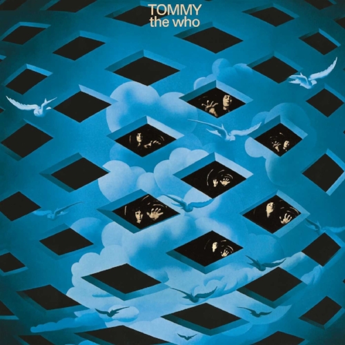
The Who - Tommy
Released in 1969, Tommy is more than just an album of songs. To the uninitiated, Tommy is an entire rock opera. Pete Townshend, growing bored of the 3-minute pop songs The Who had become famous for, wrote an epic story tied to his music, full of characters and plot related to the teachings of Baba introduced to him by art director Mike McInnerney. Townshend felt that McInnerney would be the perfect artist, gave him an outline of the story and let him go to work.
What was finalized remains legendary today, a world made of webs - clouds and birds surrounding, with The Who’s members trapped inside, reaching out for escape. McInnerney successfully conveyed the story of Tommy - the pinball wizard that’s deaf, dumb and blind - trapped in his own world deciding to "depict a kind of breaking out of a certain restricted plane into freedom", according to him. Tommy is a complete experience as a result and helped push the medium into new realms of storytelling.
Courtesy of Harvest/Capitol Records
Pink Floyd - Dark Side of The Moon
A simple triangle, one beam of light entering and a spectrum of color exiting, that’s it. So how can something so simple become so much a part of pop culture that it’s adorned college walls, lunch boxes and T-shirts for decades? An image so synonymous with classic rock that its probable more people could identify the artwork than a song from the album itself? Similar to music, emptiness creates more dynamics, and this is very true with the otherwise all-black cover by graphic designer Storm Thergerson. Sure there is symbolism in the art, the triangle is said to represent freedom of thought and ambition, for example, an important part of Roger Water’s lyrics on the album, but it likely anything deep ends there. The reality is that Storm was attempting to push, promote and shout out Pink Floyd’s not yet famous light shows, an important part of the Pink Floyd experience forever memorializing them in such a way that the artwork has likely eclipsed the music itself.
Courtesy of Capitol Records
The Beatles - Sgt. Pepper's Lonely Hearts Club Band
There’s no simple way to put it - The Beatles took album covers seriously, and this one may be the pinnacle of album cover history. It is regularly considered the greatest album cover of all-time by industry-leading magazines and journalists. Why? Well, this isn’t a photo pieced and collaged together with the magic of Photoshop or a computer. Everything you see is a practical effect meaning it was all there physically in a studio when The Beatles showed for the shoot.
Courtesy of Rolling Stone Magazine
The younger versions of The Beatles they stand next to are life-size wax models, and there are 5 other life-sized wax models among the bunch courtesy of Madame Tussaud. The remaining celebrities are cardboard cutouts, some 50-plus of them, and said to stand "as a guidebook to the cultural topography of the decade" according to musicologist, Ian Inglis. The flowers were painstakingly pieced together, and the drum hand-painted showing that no detail was left unchecked.
Courtesy of Rolling Stone Magazine
The album also included a sheet of cardboard cut-outs, a postcard-sized portrait of Sgt. Pepper based on a statue from Lennon's house that was used on the front cover, a fake mustache, two sets of sergeant stripes, two lapel badges and a stand-up cut-out of the Beatles in their satin uniforms. The inclusion of these items helped fans "pretend to be in the band". Conspiracy and secret meaning run deep with The Beatles lore, however, leading many fans to speculate a deeper meaning to the goods. Perhaps putting the mustache on backward is telling? We may never know, but by today’s standards, this cover is an entire production in itself. Saying so much about The Beatles, the era and even their transition from the 1960's to the '70's, which explains why in today’s dollar valuation this cover would have cost an estimated $71,000 to reproduce and likely will never be matched.
Courtesy of Rolling Stones Records
The Rolling Stones - Sticky Fingers
The 1971 release of The Rolling Stones’ “Sticky Fingers” featured the first release of their now infamous tongue and lips logo, but that’s not why this album makes the list. Innuendo aside, and there is a ton of it on this album. The art design was first conceived by none other than Andy Warhol, the extravagant New York pop artist making waves during the era. Warhol took what at the time was a mostly 2-D medium and added an actual zipper to the cover of the album that could be unzipped revealing another layer depicting white cotton undies. Nothing like it had been previously made and it created a stir regarding censorship even finding an alternative cover in several countries. It even was met with production issues as the zipper often damaged the vinyl albums when they were stacked together, an issue corrected by shipping the albums "partially unzipped". However, it marked a creative point for album covers and mixed well with the already over the top provocation and innuendo constantly offered up by The Stones.
Courtesy of Factory Records
Joy Division - Unknown Pleasures
There aren’t too many album covers created by scientists so it makes sense that the cover for Unknown Pleasures would work its way into iconic status by that fact alone. The image, originally created by radio astronomer Harold Craft as part of his thesis in 1970, is that of the intensity of successive radio pulses coming from a white dwarf star far in space called CP 1919. Susie Goldring, a BBC Online reviewer said, "The duochrome Peter Saville cover of this first Joy Division album speaks volumes. Its white on black lines reflect a pulse of power, a surge of bass, and raw angst. If the cover doesn't draw you in, the music will.” She was right too, as the image became so popular it was soon emblazoned across t-shirts and random merchandise of the time and has become an important image among a sea of album covers.
Courtesy of Verve/MGM Records
The Velvet UnderGround & Nico - The Velvet UnderGround & Nico
Andy Warhol tops the list once again as this is yet another album where the imagery created for it likely has outpaced the music to some degree. The infamous banana cover, enticed the owner to “peel slowly and see” with a sticker that when peeled uncovered a pink flesh-colored banana instead, something seemingly taboo when it was released in 1967. The special design was elaborate enough to require an entirely new machine to create and solely caused a delay in the release of the album. MGM, the artist’s label, didn’t mind because just having an Andy Warhol image on your album was guaranteed to boost sales during the time. While sales may have been helped by Mr. Warhol’s art, the album was initially met with disappointing sales and a lack of critical acclaim, not finding its way into critic’s hearts for another ten years or so. No matter, the cover image became so popular it was copied, ripped and illegally used becoming the center of many lawsuits throughout the years. The art is simple, but anything that requires entirely new machinery to produce clearly pushes the medium into new territories, especially during the 1960's.
Courtesy of Atlantic Records
Led Zeppelin - Houses of The Holy
An argument could be made for every single Led Zeppelin release and the importance of it’s cover art that choosing one is a tough gig. From the exploding Hindenberg of their debut release, to the wheel of images that could be changed out on both “III” and “Physical Graffiti”, Led Zeppelin placed an important focus on the art direction of their covers led by lead guitarist, Jimmy Page. Houses of The Holy stands alone to us because it is a composite photograph that took 10 days to shoot at The Giant’s Causeway in Northern Ireland due to inclement weather. Only two siblings were used as the children climbing the rocks, inspired by the ending to the novel “Childhood’s End” by Arthur C. Clarke. The image is striking, tells a story and was composited and tinted in an era when that work was beyond painstaking.
Courtesy of Epic/Sony Records
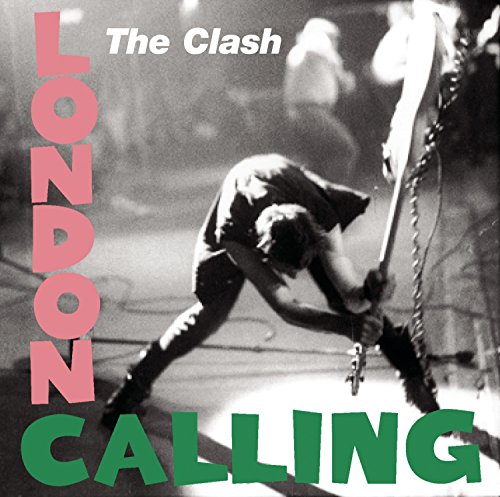
The Clash - London Calling
The Clash’s third release “London Calling” captured everything that punk music of the 1970’s encapsulated. A seemingly violent fury of music brought from angst and frustration of the British youth during the time. The image, of Paul Simonon smashing his bass guitar against the stage of New York’s The Palladium, was captured by Pennie Smith as Simonon smashed his bass out of frustration that the stadium-style seating and security prevented concertgoers from standing up out of their seats making for a boring punk rock experience. In 2002, Q magazine named Smith's photograph the best rock and roll photograph of all time, commenting that "it captures the ultimate rock 'n' roll moment – total loss of control". Everything that punk rock was to inspire.
Courtesy of RCA Records
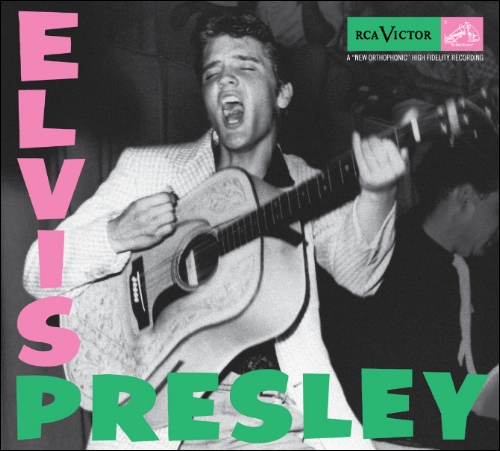
The photo itself isn’t the only reason this cover is important though. In a shout-out to The King of rock n’ roll, The Clash paid homage to Elvis Presley’s first album release with it’s pink and green font colors. It’s important to remember that similar to The Clash, Elvis was controversial in his time as well, facing censorship against his now tame hip shifting innuendos. He also brought forth a new wave of music to pop culture just like the British punk invasion. So while musically they seem nothing the same, The Clash seemed attuned to the mark they were leaving on the musical landscape, much like The King.
Courtesy of Virgin Records
Sex Pistols - Nevermind The Bollocks, Here’s The Sex Pistols
A seemingly basic design compared to everything on this list “Nevermind The Bollocks” marks its importance because of its battle within the censorship of art after finding itself in the middle of a court case regarding the term “bollocks”. Johnny Rotten, the band’s frontman explained that the term “never mind the bollocks” was simply blue collar slang for “don’t talk rubbish”. London police disagreed and went after Virgin Records forcing them to change the album displays by blocking out the word “bollocks” or even removing them entirely. The case against Virgin was picked up by UK courts and soon The Sex Pistols were part of a fight against general censorship eclipsing anything regarding the album’s music itself but displaying everything that punk music stood for. In the end, punk rock prevailed as Virgin’s own Richard Branson hired defense counsel John Mortimer who was able to produce expert witnesses showing that the term “bollocks” was nothing more than an Olde English word equating to “nonsense” and begrudgingly the courts were forced to agree cementing this cover's importance in music history.
Nirvana - Nevermind
Nevermind is the quintessential ‘90’s album. It changed rock music, pulling away from the big-haired glam rock of the ‘80’s and solidifying fashion and music for an entire generation that is felt nearly 30 years later. The cover lambasts consumer culture, insinuating that we are teaching youth to be obsessed with consumer culture from birth. A culture where the almighty dollar is the end all toward ultimate happiness and dare we say it, nirvana. This statement would remain a common theme with many of Kurt Cobain’s musings from his now famous paintings and art to lyrics, journals, and self-made T-shirts.
Courtesy of Rolling Stone Magazine
Furthermore, the fully naked baby caused uproar leading to censorship of the natural nudity leading to Cobain insisting that the only acceptable censorship would be a sticker covering the baby that read “If you’re offended by this, you must be a closet pedophile.” For the suburban youth of the ‘90’s, it was likely their first dip into counter-culture, whether they realized it or not and has become the face of 1990’s culture that maybe didn't start with Nirvana but was absolutely a part of the beginning of grunge.
We left so many off this list from Rage Against The Machine's debut to Metallica, Yes, and Prince's "Purple Rain". It's simply impossible to mention every great album cover. So what did we miss? What are your favorites?


